 Statistics is concerned with the collection, presentation and analysis of information and data.
There are two main types of data that can be collected:
Discrete data This is data that is usually whole numbers and is often collected by counting.
e.g. The number of people at a sports game or the number of cars sold.
Continuous data This data is usually the result of measuring and can be any type of number.
e.g. The heights of people or the weights of passengers' bags at an airport.
Once data has been collected, it can be shown in tables and graphs.
The following types of graph are usually used for discrete data.
IMPORTANT Care must be taken to ensure that each graph has:
- a title,
- labelled axes
- appropriate scales
- units indicated
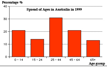
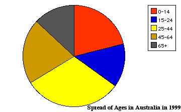
To show the various types of graphs, the following set of data will be used to show the spread of ages in Australia in 1999.
|
Spread of ages |
45 − 64
|
65+
|
|||
|
% of population |
21
|
13
|
Pictograph or Pictogram
|
Pictographs represent the information with pictures. Spread of Ages in Australia in 1999 Scale: Each picture represents 7% |
0 -14
|
|
|
15 − 24
|
||
|
25 − 44
|
||
|
45 − 64
|
||
|
65+
|
Column graph
(This is sometimes called a bar or block graph.)
- The height of the column is proportional to the number of times each event occurs.
- The thickness of each column is the same.
- The bars could also be drawn horizontally.
A histogram, studied in more detail in Year 10, Topic 49, is a bar graph where the bars touch and is usually used for continuous data, often measurments, which is represented on the horizontal axis.
Pie graph
This is sometimes called a pie chart or sector graph.
- A circle is divided into sectors. The angle of each sector represents the fraction each event is out of the total number of events.
- Pie graphs require calculations and the use of protractors.
|
0-14 age group needs an angle of 21% of 360 = 75.6°15-24 age group needs an angle of 14% of 360 = 50.4° 25-44 age group needs an angle of 31% of 360 = 111.6° 45-64 age group needs an angle of 21% 0f 360 = 75.6° 65+ age group needs an angle of 13% 0f 360 = 46.8° |
 |
Misleading Statistical Graphs
Graphs that are titled or labelled incorrectly or have uneven scales or no scales at all can be misleading. This can be done deliberately or by accident.
e.g. A company making breakfast cereals BreakHealth Company claims to be growing really quickly and uses this graph to show the growth in sales over the past 5 years.
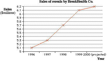
This graph appears to show rapid growth because of its steepness but its slope is greater because of the fact that the sales scale starts at 5 million.