|
 Statistics is concerned with the collection, presentation and analysis of information and data. Statistics is concerned with the collection, presentation and analysis of information and data.
Once data has been collected, it can be shown in tables and graphs.
The following types of graph can be used.
IMPORTANT Care must be taken to ensure that each graph has:
- a title,
- labelled axes
- appropriate scales
- units indicated
To show the various types of graphs, the following set of data will be used to show how a group of school pupils travel to school.
|
Means of transport
|
Bus |
Car |
Foot |
Bicycle |
|
Number of pupils using this type of transport
|
24 |
6 |
18 |
12 |
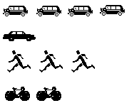
Pictographs or Pictogram
|
Pictographs represent the information with pictures.
How pupils travel to school
Scale: Each picture represents 6 pupils
|
|
Bus
Car
Foot
Bicycle
|
Column graph(This is sometimes called a bar or block graph.)
- The height of the column is proportional to the number of times each event occurs.
- The thickness of each column is the same.
- The bars could also be drawn horizontally.

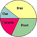
Pie graph
This is sometimes called a pie chart or sector graph.
- A circle is divided into sectors. The angle of each sector represents the fraction each event is out of the total number of events.
- Pie graphs require calculations and the use of protractors.
In our example, as there are 60 people, each person is shown by 360°  60° = 6° 60° = 6°
This means that:
|
Bus needs an angle of 24 x 6°= 144°
Car needs an angle of 6 x 6° = 36°
Foot needs an angle of 18 x 6° = 108°
Bicycle needs an angle of 12 x 6°= 72°
|
 |
See an interactive example of a pie chart − 
(This activity was produced by the Shodor Education Foundation.)
|
