Statistics is concerned with the collection, presentation and analysis of information and data. Once data has been collected, it can be shown in tables and graphs. The following types of graph can be used.
IMPORTANT Care must be taken to ensure that each graph has:
- a title,
- labelled axes
- appropriate scales
- units indicated
To show the various types of graphs, two sets of data will be used:
Set One
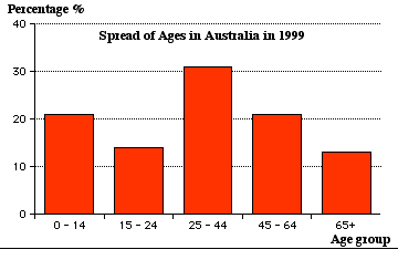
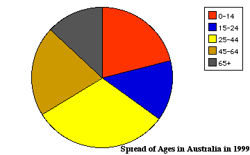
The following data shows the spread of ages in Australia in 1999.
|
Spread of ages |
45 − 64
|
65+
|
|||
|
% of population |
21
|
13
|
Pictograph or Pictogram
|
Pictographs represent the information with pictures. Spread of Ages in Australia in 1999 Scale: Each picture represents 7% |
0 -14
|
|
|
15 − 24
|
||
|
25 − 44
|
||
|
45 − 64
|
||
|
65+
|
Column graph
(This is sometimes called a bar or block graph.)
- The height of the column is proportional to the number of times each event occurs.
- The thickness of each column is the same.
- The bars could also be drawn horizontally.
A histogram, studied in more detail in Year 10, Topic 49, is a bar graph where the bars touch and is usually used for continuous data, often measurments, which is represented on the horizontal axis.
 Pie graph

This is sometimes called a pie chart or sector graph.
- A circle is divided into sectors. The angle of each sector represents the fraction each event is out of the total number of events.
- Pie graphs require calculations and the use of protractors.
|
0-14 age group needs an angle of 21% of 360 = 75.6°15-24 age group needs an angle of 14% of 360 = 50.4° 25-44 age group needs an angle of 31% of 360 = 111.6° 45-64 age group needs an angle of 21% 0f 360 = 75.6° 65+ age group needs an angle of 13% 0f 360 = 46.8° |
 |
Set Two
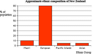
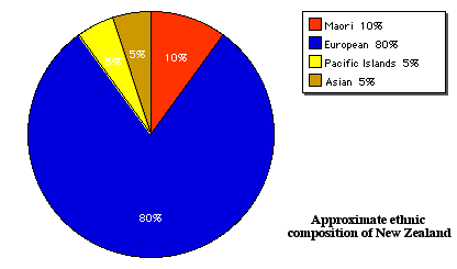
To show the various types of graphs, the following set of data will be used to show the estimated percentages of the different ethnic groups in New Zealand in the late 20th century.
|
Approximate Ethnic Composition of New Zealand |
Asian
|
|||
|
% of population |
5
|
Other ethnic groups made up less than 1% of the population
Pictograph or Pictogram
|
Pictographs represent the information with pictures. Ethnic Composition of New Zealand Scale: Each picture represents 5% |
Mãori | |
| European | ||
| PacificIslands | ||
| Asian |
Column graph
Pie graph
|
Maori needs an angle of 10% of 360 = 36°European needs an angle of 80% of 360 = 288° Pacific Islands needs an angle of 5% of 360 = 18° Asian needs an angle of 5% 0f 36 = 18° |
 |
See an interactive example of a pie chart − ![]()
(This activity was produced by the Shodor Education Foundation.)