 The frequency is the number of times each score, event or measurement occurs. A frequency distribution is shown in a table in which information or data is arranged in order. From the frequency distribution, the average and range can be found, and the data can be shown on graphs such as histograms, frequency curves and cumulative frequency graphs.
Averages and measures of spread can be practiced using the Working with Data activity.
Definitions
- Discrete data can be counted.
e.g. Number of people in a theatre, number of leaves on a tree.
- Continuous data is obtained by measuring.
e.g.Heights of people, lengths of leaves on a tree.
- Ungrouped data is used with small amounts of data where individual scores are listed.
e.g.Test results of five people: 15, 20, 18, 17, 16
- Grouped data is used with larger amounts of data where scores are placed in groups or classes.
e.g.Test results of 30 people
Averages
An average is a number that typifies a set of numbers or statistics.
There are three commonly used types of average.
- Median.The median of a set of scores is the middle score when the scores have been arranged in order from smallest to largest.
- Mode.The mode is the most frequent score, that is, the one that occurs most often.
- Mean.
|
The mean of a set of scores is the sum of all of the scores divided by the number of scores. |
|
The mean is often known as the average. |
|
The symbol for the mean is |
|
For ungrouped data, |
|
For grouped data, |
|
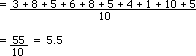
For the following set of test results of 10 people: 3, 8, 5, 6, 8, 5, 4, 1, 10, 5 Find: (a) The mean (b) The mode (c) The median
|
(a) The mean (b) The mode = 5 (occurs 3 times) (c) Arrange in order: 1, 3, 4, 5, 5, 5, 6, 8, 8, 10 Median is 5 |
Findng the mean on a calculator
The procedure for finding statistical values will vary slightly from calculator to calculator.
For a typical scientific calculator, to find the mean of 5, 7, and 12:
|
Task
|
Press
|
Action
|
| Select the statistical mode |
MODE
|
Gives three choices: COMP(1), SD(2) or REG(3) Selects SD (statistics) mode. |
| Enter the data |
|
Enters the three numbers 5, 7 and 12. |
| Find mean |
|
Finds the mean, |
| Clear old data |
|
Always do this before entering new data. |
Pressing RCL and C on this calculator to find n is a good check to see that all values have been added.
In this case if should give n = 3.
Finding the mean on a spreadsheet
Enter the data:
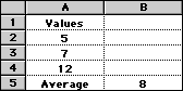
The function entered in cell B5 to find the mean is =AVERAGE(A2..A4) this gives a mean of 8.
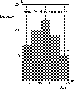
Histogram
A histogram is a graph that is used to show the information from a frequency distribution.
It is similar to a column graph and the area of each column is proportional to the frequency of the score that it represents.
In a histogram the bars always touch, whereas in a bar graph the bars do not need to touch.
e.g Ages of workers in a company.
Note that this is grouped data.
|
i.e Greater or equal to 15 but less than 25. Different people use different ways of presenting this type of data. |
|
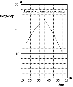
Frequency Curve
This is sometimes called a frequency polygon or line graph.
A frequency curve is obtained by joining up the mid-points of the tops of the columns of the histogram.
e.g. For the ages of the workers.
Stem and Leaf Diagram
A stem and leaf diagram or chart provides a means of ordering and displaying data.
Numbers are split into categories of the first digit(s) and the last digits(s)
e.g. Given the following test scores:
06, 24, 43, 23, 12, 34, 21, 08, 15, 47,
40, 20, 12, 05, 19, 28, 34, 23, 39, 34
Let the stem be the first digit (the tens column). Now enter each of the second digits (the units column) into the leaf part of the diagram.
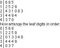
Both parts of a stem and leaf diagram can contain more than one digit.
e.g. For numbers such as 3476, the stem could be 34 and the leaf could be 76.
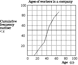
Cumulative Frequency Curve
In a cumulative frequency table, each of the scores from the frequency distribution is added to the total of the ones before it.
e.g. For the ages of the workers:
Measures of Spread
As well as averages, it is necessary to have a measure of how spread out the scores are.
The range and quartiles are ways of measuring this spread.
Range
The range of a set of scores is the difference between the highest and the lowest scores.
e.g. For {4, 5, 6, 7, 8, 9, 10} the range is 10 − 4 = 6
Quartiles
The quartiles divide a distribution into four equal parts.
- For ungrouped data {4, 5, 6, 7, 8, 9, 10}:
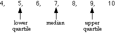
- The interquartile range is the difference between the upper and the lower quartiles
i.e. Interquartile range = 9 − 5 = 4
- For grouped data the quartiles and median can be obtained by using the vertical axis of the cumulative frequency curve. The total number of scores is divided by four and then read off using the scale.
Box and Whisker Graphs
Box and whisker graphs are useful for comparing the data in different frequency distributions.
The diagrams consist of a rectangle which indicates the quartiles and the median, and a line on each end to show the maximum and minimum values of the distribution.
e.g.Draw a box and whisker diagram to compare the following frequency distributions of two schools' mathematics examination results.
School A: Median, 51; Lower quartile, 42; Upper quartile, 65; Maximum, 95; Minimum, 23
School B: Median, 54; Lower quartile, 39; Upper quartile, 68; Maximum, 99; Minimum, 15
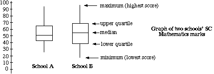
From the diagram above, the two sets of marks can now be compared.
School B would appear to have the higher marks with a higher median, upper quartile and maximum.
School A's results are less spread, with an interquartile range of 23, compared to School B's 29.