 Box and whisker graphs are useful for comparing the data in different frequency distributions.
The diagrams consist of a rectangle which indicates the quartiles and the median, and a line on each end to show the maximum and minimum values of the distribution.
Example
Draw a box and whisker diagram to compare the following frequency distributions of two schools' mathematics examination results.
School A: Median, 51; Lower quartile, 42; Upper quartile, 65; Maximum, 95; Minimum, 23
School B: Median, 54; Lower quartile, 39; Upper quartile, 68; Maximum, 99; Minimum, 15
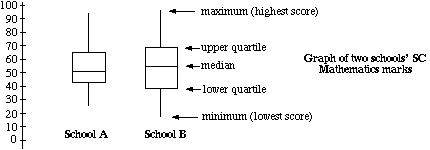
From the diagram above, the two sets of marks can now be compared.
School B would appear to have the higher marks with a higher median, upper quartile and maximum.
School A' s results are less spread, with an interquartile range of 23, compared to School B 's 29.