|
Statistics is concerned with the collection, presentation and analysis of information and data. This statistical data can be displayed in several different forms including tables, diagrams and graphs.
Care must be taken to ensure that each graph has:
- a title,
- labelled axes
- appropriate scales
- units indicated
Frequency Tables
The frequency is the number of times each score, event or measurement occurs.
A frequency table is a table in which information or data is arranged in order. Frequency tables make data easier to read and analyse.
A tally can be used to help add up, in groups of five, the number of times an item occurs. Note that 1111 means 5 items.
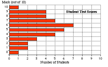
e.g. The test results of 40 people in a test out of 10 shown below are tallied and placed in a table:
2, 7, 1, 3, 4, 5, 6, 9, 10, 3, 6, 8, 9, 6, 5, 7, 9, 2, 4, 5, 6, 7, 5, 4 , 8 , 7, 6, ,4, 5, 6, 8, 9, 3, 1, 0, 6, 8, 5, 7, 4
| Score |
Tally |
Frequency
|
|
0
|
1
|
1
|
|
1
|
11
|
2
|
|
2
|
11
|
2
|
|
3
|
111
|
3
|
|
4
|
1111
|
5
|
|
5
|
1111 1
|
6
|
|
6
|
1111 l l
|
7
|
|
7
|
1111
|
5
|
|
8
|
l l l l
|
4
|
|
9
|
l l l l
|
4
|
|
10
|
1
|
1
|
|
Total
|
40
|
From the frequency table a bar graph can be drawn.
Bar or Column Graphs
Bar or column graphs are usually used for DISCRETE data, usually whole numbers, and the result of a counting process.
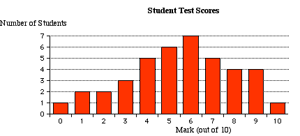
Bar graphs can also be drawn horizontally.
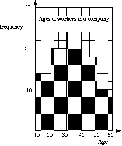
Histogram
Sometimes, when each item has a different value, data has to be grouped together.
This is often CONTINUOUS data and is the result of items being measured.
e.g. Heights of people, lengths of leaves on a tree, times of runners.
A histogram is a graph that is used to show the information from a frequency table of this type.It is similar to a column graph but the bars are always joined together.
|
e.g Ages of workers in a company.
Note that this is grouped data.
| Ages |
Frequency |
| 15 - |
14 |
| 25 - |
20 |
| 35 - |
24 |
| 45 - |
18 |
| 55 − 65 |
10 |
15 -
means greater or equal to 15 and less than 25
|
|
To show the pictograph and the pie graph the following set of data will be used to show how a group of 60 school pupils travel to school.
|
Means of transport
|
Bus |
Car |
Foot |
Bicycle |
|
Number of pupils using this type of transport
|
24 |
6 |
18 |
12 |
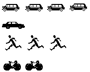
Pictographs or Pictogram
Statistical graphs in magazines and reports are often drawn using pictures.
|
How 60 pupils travel to school
Scale: Each picture represents 6 pupils
|
|
Bus
Car
Foot
Bicycle
|
Pie graph 
This is sometimes called a pie chart or sector graph.
- A circle is divided into sectors. The angle of each sector represents the fraction each event is out of the total number of events.
- Pie graphs require calculations and the use of protractors.
In our example, as there are 60 people, each person is shown by 360° ÷ 60° = 6°
This means that:
|
Bus needs an angle of 24 x 6°= 144°
Car needs an angle of 6 x 6° = 36°
Foot needs an angle of 18 x 6° = 108°
Bicycle needs an angle of 12 x 6°= 72°
|
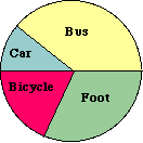
How 60 pupils travel to school
|
Time Series Graphs
A time series graph is a line graph of repeated measurements taken over regular time intervals.
Time is always shown on the horizontal axis.
On time series graphs data points are drawn at regular intervals and the points joined, usually with straight lines.
Time series graphs help to show trends or patterns.
e.g. Polar Cream Ltd, an ice cream company, shows its sales over the past three years, taken every three months, on the time series graph below. (Quarter 1 is for January, February and March)
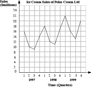
From the graph it can be seen that ice cream sales are seasonal (high in summer-low in winter).
There would also seem to be a trend towards higher sales each year.
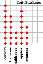
Dot Plots
These graphs are used to clearly show comparisons between different numbers of items. Each item is shown by a dot.
|
A student purchased the following items at a supermarket:
8 carrots
6 bananas
3 cabbages
7 apples
4 oranges
Show on a dot plot.
|
|
Strip Graphs
These graphs are also used to show comparisons between different numbers of items. Each part of the bar strip is proportional to the number of items. Strip graphs can also be shown as percentages.
|
A man made the following trips to Europe:
France − 4 visits
Germany − 3 visits
Spain − 2 visits
Italy − 1 visit
Show this information on a strip graph.
|
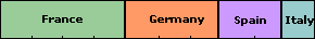
Visits to Europe
|
|