|
The frequency is the number of times each score, event or measurement occurs. A frequency table a table in which information or data is arranged in order. A tally can be used to help add up, in groups of five, the number of times an item occurs. Note that
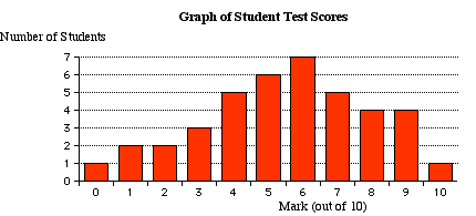
From the frequency table a bar graph can be drawn.
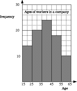
HistogramSometimes, when each item has a different value, data has to be grouped together. e.g. Heights of people, lengths of leaves on a tree, times of runners. A histogram is a graph that is used to show the information from a frequency table of this type. It is similar to a column graph but the bars are always joined together.
Frequency CurveThis is sometimes called a frequency polygon or line graph. A frequency curve is obtained by joining up the mid-points of the tops of the columns of the histogram. They are useful for showing trends. In the graph below, there would appear to be fewer workers as age increases past 40. e.g. For the ages of the workers shown above. 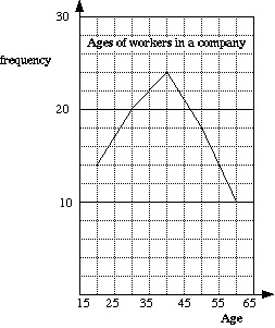 |
|||||||||||||||||||||||||||||||||||||||||||||||||||||||||
Terms of Use | Privacy Statement © 2014 BestMaths
![]()
![]()
![]()
![]()