|
Q1:
|
The graph shows the composition of an export order of fruit.
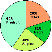
In a order of fruit of 20 000 tonnes, what weight of apples would there be?
|
A. 600 tonnes
B. 6000 tonnes
C. 3000 tonnes
D. 15 000 tonnes |
Answer 1:
|
|
|
Q2:
|
In the graph in question 1, the angle at the centre of the "Kiwifruit"
sector should be: |
A. 160°
B. 72°
C. 108°
D. 144° |
Answer 2:
|
|
|
Q3:
|
Which fruit is least in demand? |
A. Apples
B. Pears
C. Kiwifruit
D. Other |
Answer 3:
|
|
|
Q4:
|
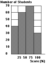 The graph shows the test scores of 200 students. What type of graph is it? |
A. Pictograph
B. Pie chart
C. Bar graph
D. Line graph |
Answer 4:
|
|
|
Q5:
|
In the graph in question 4, the fraction of students who
scored between 25% and 50% is |
A. 
B. 
C. 
D.  |
Answer 5:
|
|
|
Q6:
|
In the graph in question 4, how many students scored over 50 marks?
|
A. 100
B. 70
C. 130
D. 60 |
Answer 6:
|
|
|
Q7:
|
In a pie graph showing a survey of 300 people,
100 say "Yes" to tax increases.
What would the angle be at the centre of the
circle for the "Yes" sector? |
A. 100°
B. 120°
C. 150°
D. 180° |
Answer 7:
|
|
|
Q8:
|
In a pictograph each picture represents 4 items.
How many items would 3.5 pictures represent?
|
A. 15 items
B. 14 items
C. 13 items
D. 12 items |
Answer 8:
|
|
|
Q9:
|
What sort of graph would be best to show the results of a
survey into the expenditure within a household on food, power, rent, etc. expressed as percentages? |
A. Line graph
B. Bar graph
C. Histogram
D. Pie chart |
Answer 9:
|
|
|
Q10:
|
Which type of graph is also called a column graph? |
A. Bar graph
B. Sector graph
C. Line graph
D. Pie chart |
Answer 10:
|
|